S
tudying jewelry history can take you just about anywhere. Lately, yours truly has been lingering in the Renaissance era. Beyond looking at the glorious jewelry from the period, the paintings reveal so much about how it was worn and styled.
Header image features Yvonne Léon
The masterworks also display the Renaissance palette. Rich but soft, the colors are dreamy.
Ten Thousand Things

Image courtesy of Tabayer
The masterworks also display the Renaissance palette. Rich but soft, the colors are dreamy. They look like gemstones but not the typical ruby, emerald, sapphire jewel tones. Buttery hues echo the shade of yellow sapphires. Tawny oranges are like citrines. Light greens conjure up green amethysts. Richer greens are akin to malachite. All of it feels like it comes out of a fairytale.

Image courtesy of Anna Maccieri Rossi
When I turned from the distant past to the right now for this Trend Report the colors popped out at me in some of the new collections from COUTURE designers ANNA MACCIERI ROSSI, TABAYER, TEN THOUSAND THINGS and YVONNE LÉON.

Image courtesy of Tabayer
Tabayer
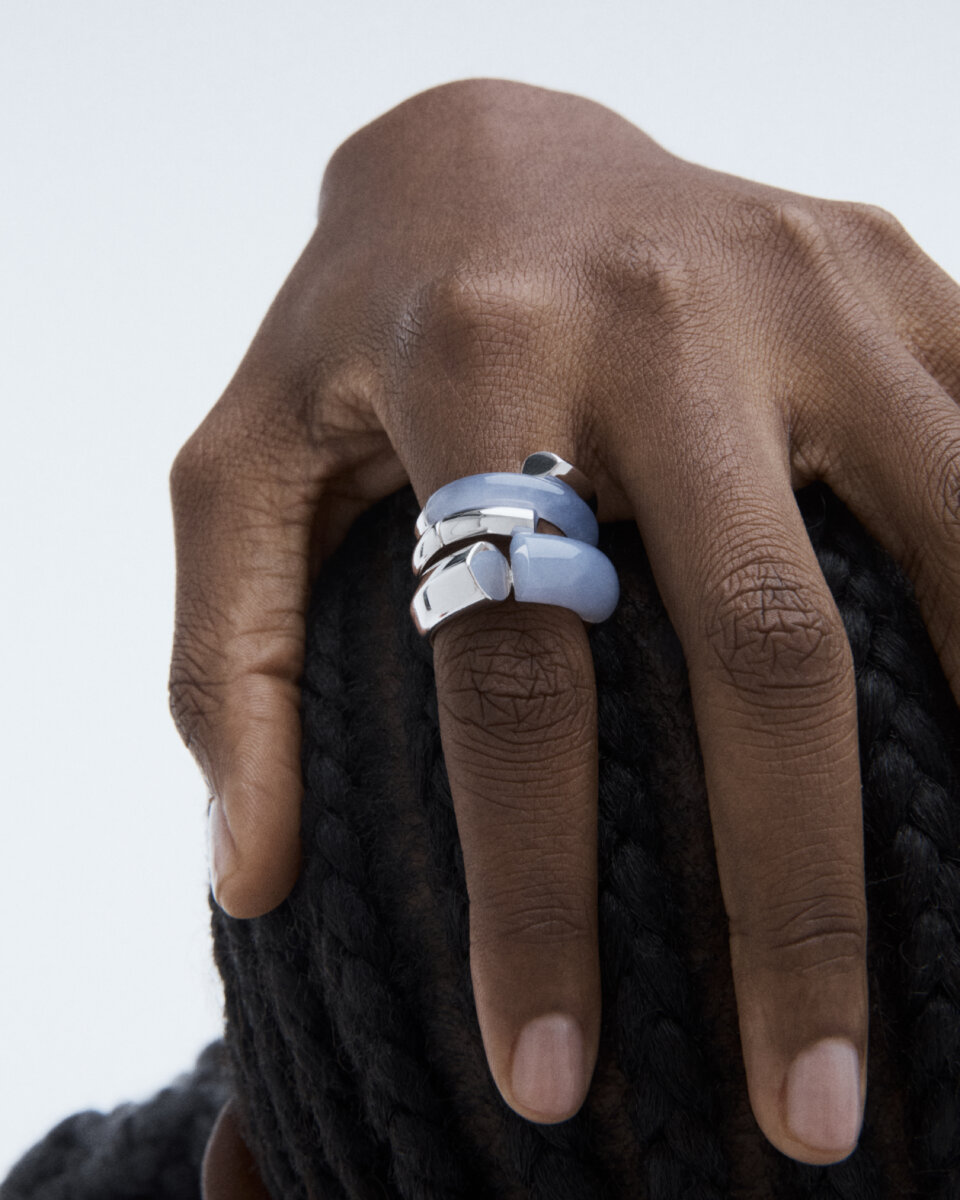
The Tabayer collection has had a strong sculptural identity from the moment founder and creative director, Nigora Tokhtabayeva launched her line in 2021. Now she has infused the bold jewels with a selection of gems creating a painterly quality.

Image courtesy of Tabayer
There are sky and milky blues in sapphires and blue chalcedony. Sienna can be found in the red jasper and carnelian. From my Renaissance perspective, the new jewels feel like Nigora’s minimalist take on the highlight colors in Botticelli’s Birth of Venus.

Image courtesy of Ten Thousand Things
Ten Thousand Things
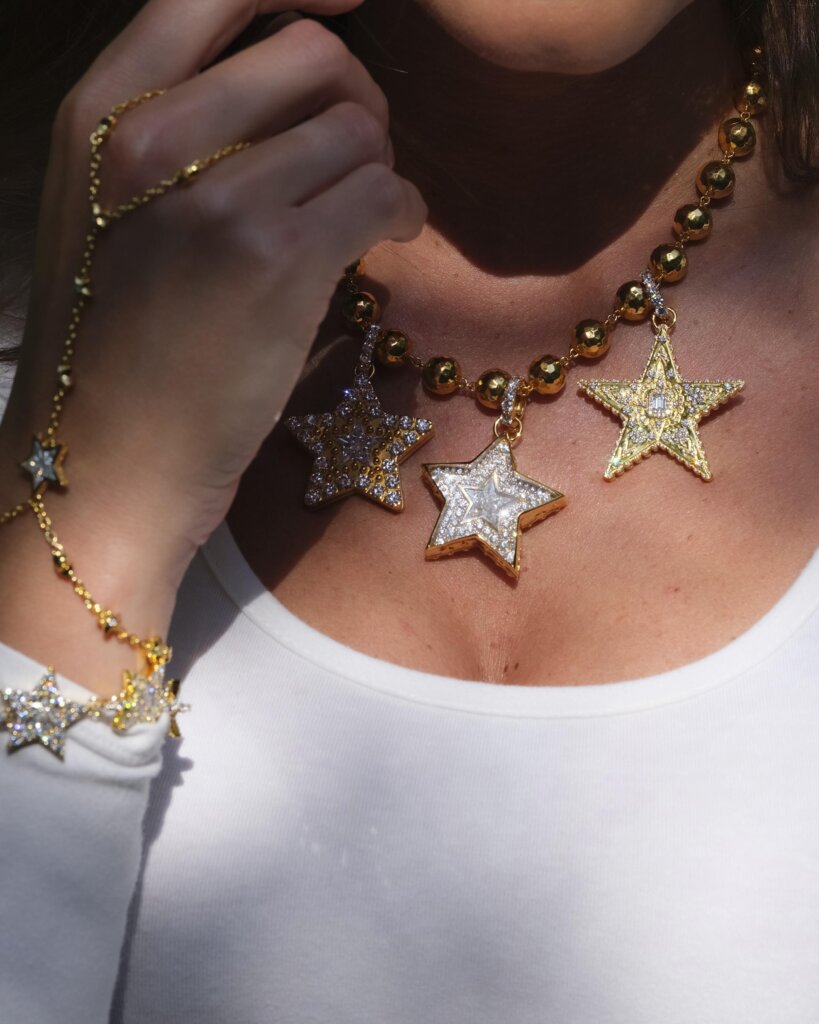
When I was talking to David Rees once about the Ten Thousand Things collection he and Ron Anderson have been creating together for just over 30 years, I asked what their palette was. He said they didn’t really have one. They worked with whatever gems they liked.

Image courtesy of Ten Thousand Things
I can see the range in the collection, but now I also see all the colors of the cloaks on the philosophers in Raphael’s famous fresco The School of Athens. David and Ron employ gems you won’t see elsewhere or too often. There is the lyrical Kyanite, soulful amber, sweet green amethyst among many others. All of the gems look utterly unique because they are hand carved in shapes designed by the dynamic duo.

Image courtesy of Anna Maccieri Rossi
Anna Maccieri Rossi
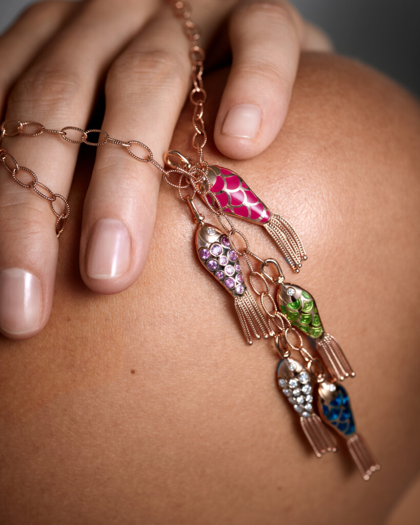
There is still such a strong spirit of the Renaissance in the air in Italy, you have a sense the DNA of the era flows in every Italian’s veins. Anna Maccieri Rossi certainly captures the period’s sense of critical thinking with conceptual jewelry that is all about time and how we spend it.

Image courtesy of Anna Maccieri Rossi
She also has a vibrant palette from the period. The blues and pinks, greens and amber hues, all can be found in Botticelli’s Spring.

Image courtesy of Yvonne Léon
Yvonne Léon
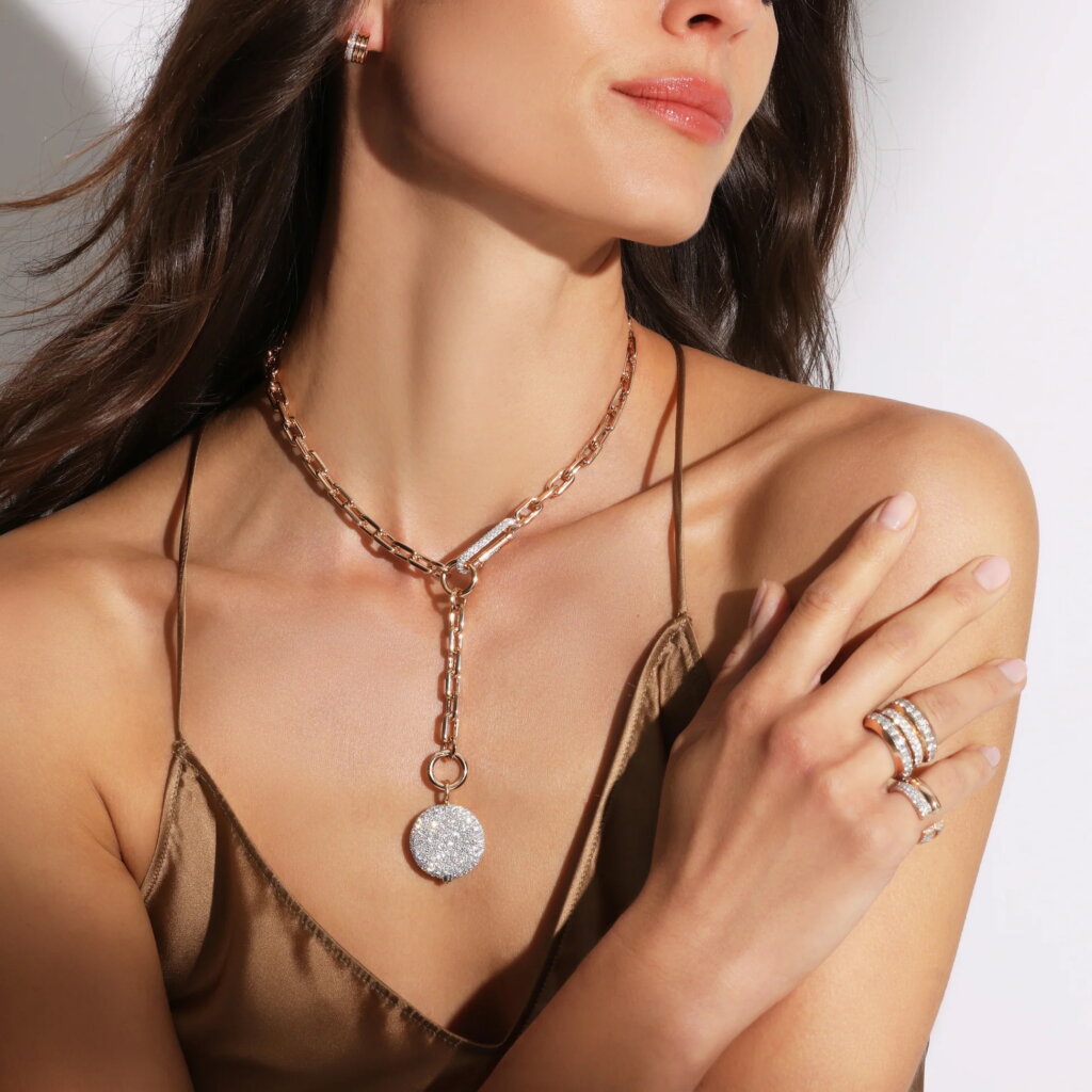
French designer Yvonne Léon reimagines classic silhouettes of signet rings and pear shape studs among other things with detailed goldwork and gems. Her creative choices infuse the designs with a fresh new feeling. Yet her gems—citrines, tiger’s eye and malachite—harken back to 1970s colors as well as the autumnal tones found in some Renaissance paintings.

Image courtesy of Yvonne Léon
I imagine the model strumming her guitar in Yvonne’s jewelry has a poster of Botticelli’s Pallas and the Centaur on her wall. The whole scene is as eternal as the Greek myth relayed in the Renaissance work of art.
Founder and Editorial Director of the online fine jewelry magazine The Adventurine, Marion Fasel is as well known for trend forecasting as her comprehensive knowledge of jewelry history. She has written 10 books on 20th century jewelry design.


